Subtle Luxury
This sumptuous pied-a-terre in London’s exclusive Ebury Square was redone in a sophisticated-yet-subtle style by renowned interior designer, Maurizio Pellizzoni.
By Teà Villamor
This deluxe two-bedroom and three bathrooms in Belgravia, where London’s elite have their multi-million properties, is a study in muted and masculine elegance.
Bought for a cool £4 million by a business professional who spends his
time between Singapore and London, the property was pared down from the ostentation of the previous design that was meant for private Russian investors, to a more elegant space. The brief was simple: A sophisticated masculine look encapsulating subtle luxury.
“Like my other properties, I wanted something modern, elegant and luxurious,” says the owner, who wanted to remain anonymous. “I wanted a place where I could entertain and enjoy my time when visiting London.”
A new build that features a private porter, gym and a private communal garden, Ebury Square is typical of the exclusive enclaves in London and the pied- a-terre in many ways, is in turn, typical of homes in the area. However, Pellizzoni’s luxe masculine aesthetic elevates this apartment. Cut to its bare bones, the pied-a-terre is a comfortable space: Two bedrooms, an open-plan living room, en-suite bathrooms, cloakroom and utility room.
Slick appeal
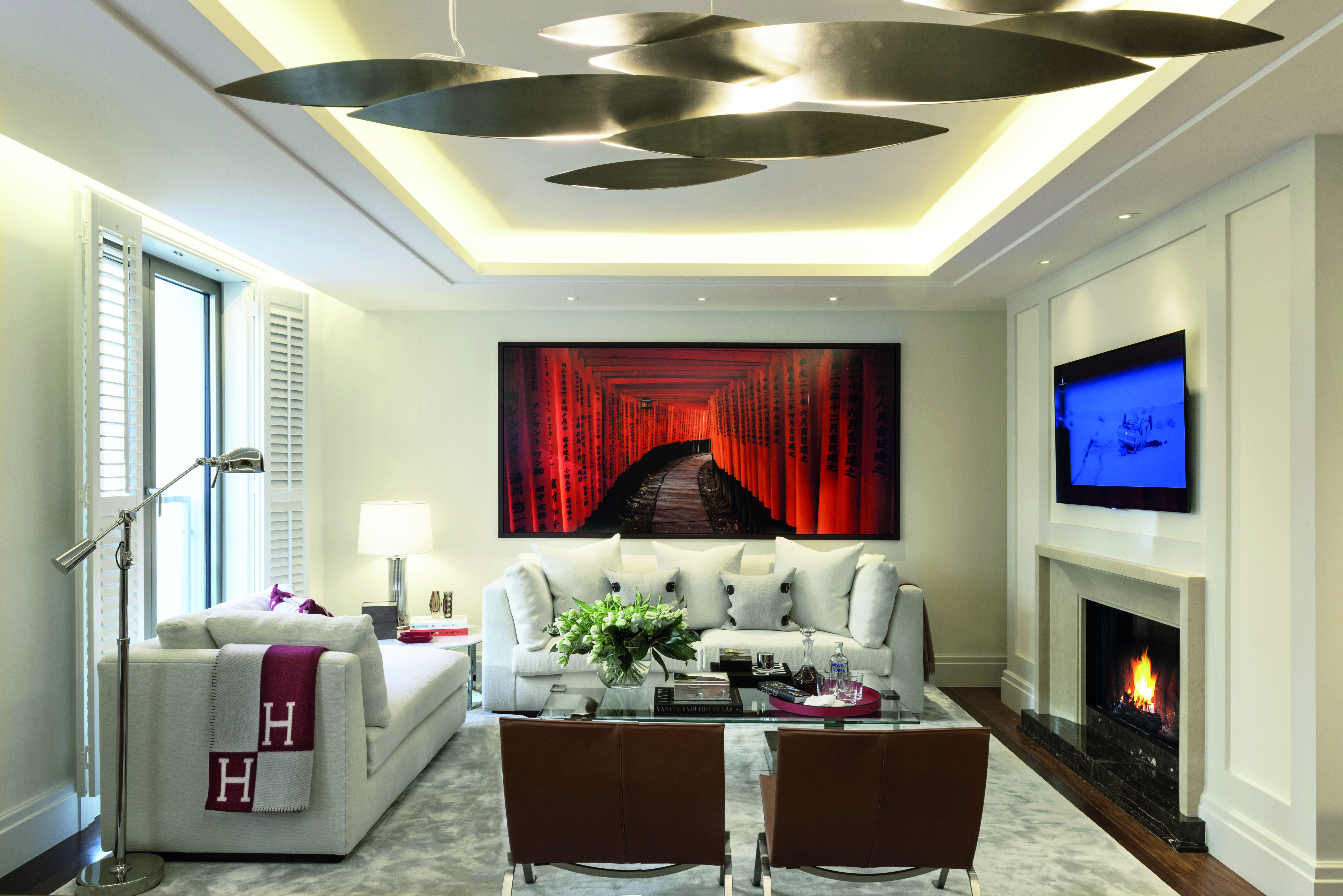
The interiors strike a balance between slick appeal and simple opulence. Pellizzoni chose a very organic and neutral colour scheme, with touches of red for continuity throughout, successfully integrating beautiful signature artwork and gold finishes.

The designer also used elegantly luxurious materials, like linen and fine leather fabrics from Ralph Lauren to Italian marble and stainless steel finishes. Grey and black matte marble surfaces on all the rooms added to the feeling of continuity throughout.
Pellizzoni replaced the herringbone flooring with large and long floorboards to give the space a more contemporary feel. The flooring continues through the open- plan living room and two bedrooms, adding to the unified look.

“The open layout was originally designed by the developer as a separate kitchen and living area. Maurizio has an amazing vision and I’m so pleased he convinced me to have it as an open plan place. It makes the entire living space more inviting and perfect for entertaining,” the owner says.
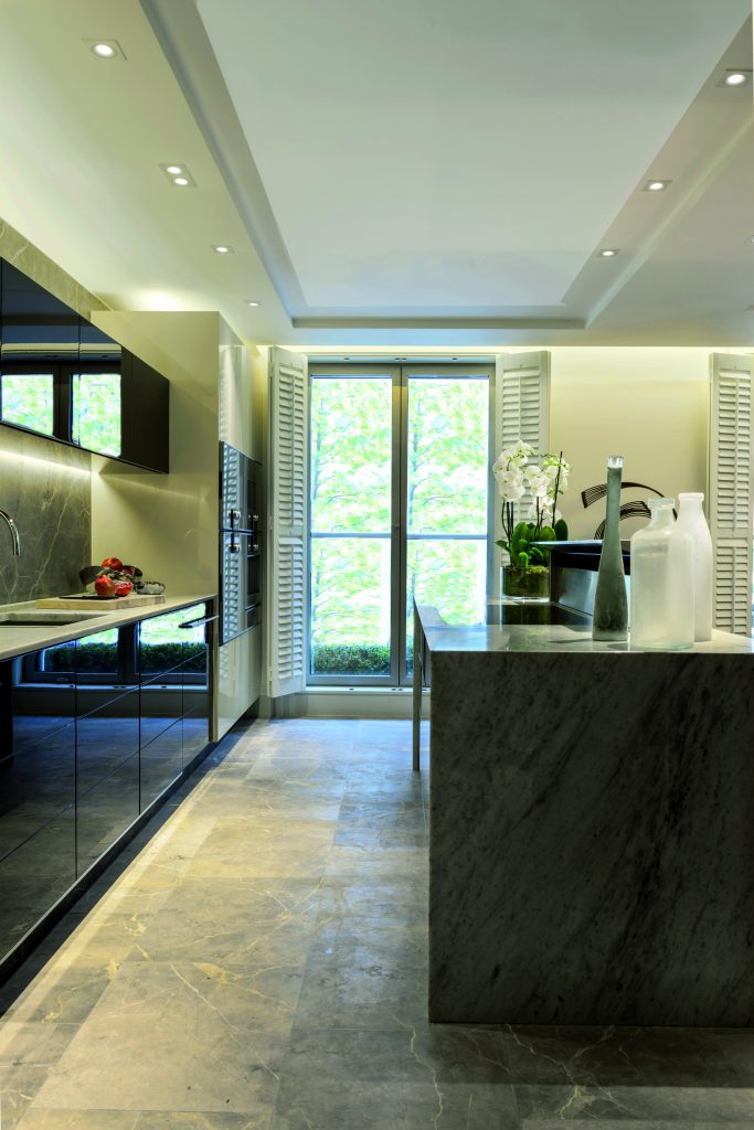
The kitchen was converted into an open plan space to allow for a comfortable space to move around and entertain in, even when hosting with a chef. Appliances, sourced thoughtfully from premium brands such as Miele, Gaggaenau and Sapphire, integrate into the multi-use space.
“The apartment was a new build so I had to choose a new kitchen to go with it,” says he. “I didn’t really like some of the choices offered by the developer so asked my Maurizio to work together with them to create my final kitchen.” He did stipulate one must-have in the brand-new kitchen: “An integrated coffee machine. I love a good espresso in the morning!”
Bringing the outdoors in
For the ground floor, Pellizzoni brought the outdoors in by decorating the space with orchids in the living area. Curved contours, linear shapes and reflective surfaces create an illusion of space. For privacy, windows are dressed with shutters to give the space a fresh and open look.
The focal point of the living room is the piece of art by Farin Urlaud that the Pellizzoni found in New York. The piece, which depicts the Torii gates of the Fushimi Inari Shrine is a magnificent piece of art that transforms the space, especially contrasting with the upholstery and soft furnishings of linen and cotton. Rugs in shades of grey, brown, and green were all custom made.
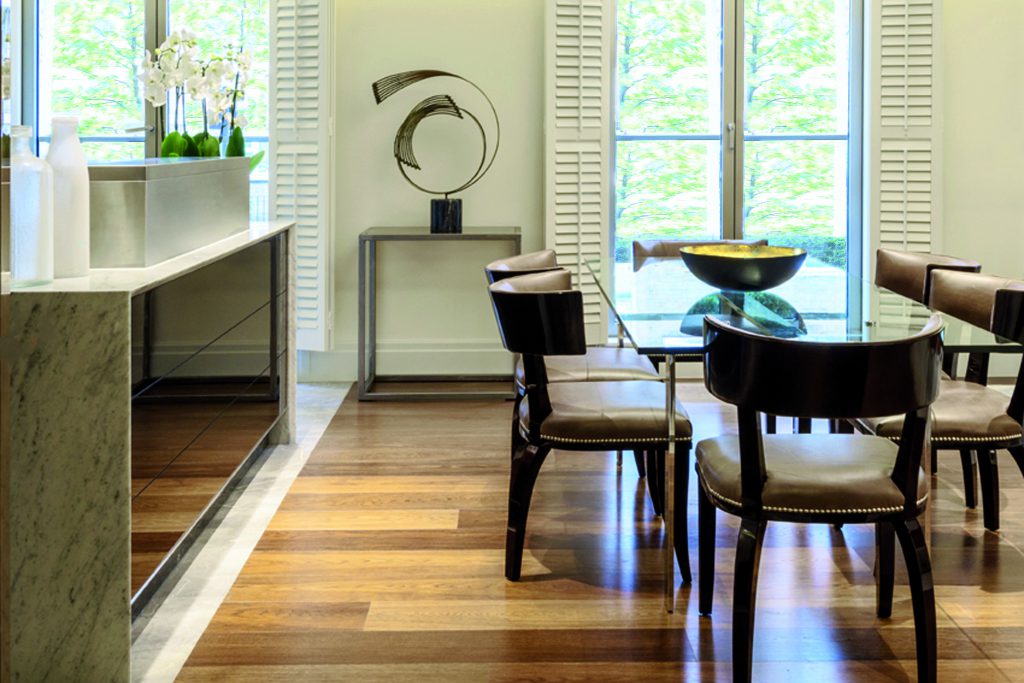
For Pellizonni, what makes the space truly stand out are the items that he personally sourced to complete the look, like the striking geometric-themed details like the sculpture in the sitting room and the aquarium.
Creature comforts
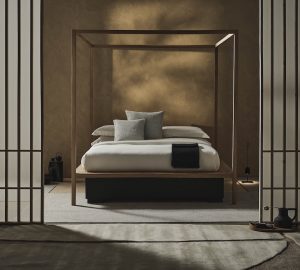
The focus on artwork continues in the master and guest bedrooms. Luxury brands such as Poliform, Linley, Ralph Lauren Home and Pellizzoni’s own boutique were used in the master bedroom, which also features a walk-in wardrobe with custom veneers on the floors and enough space for the owner’s things as well as a large Louis Vuitton trunks on display. Not surprisingly, his bedroom is the owner’s favourite part of the pied-a-terre as Pellizzoni has transformed it into something “airy and spacious,” he says. The guest suite is just as luxurious, with the same attention to detail given to the furnishings. Classical lighting and furniture designs from the 1970s add to the overall sumptuous feel.
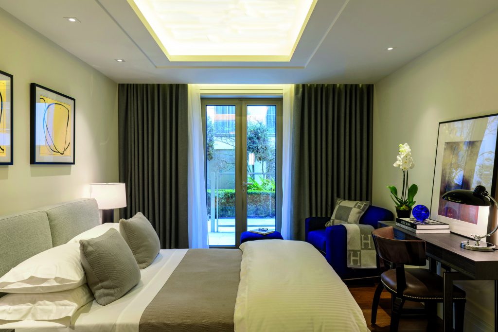
Given the level of attention and luxury given, the pied-a-terre not surprisingly feels like a sanctuary in the middle of a bustling metropolis. For the owner, it has been a satisfying process of decorating his home and trusting in the talents of a master in his field.

“The whole design of the apartment evolved from the first meeting to the result. I grew to know Maurizio well and trusted him more and more with his ideas, which I am pleased about as I love the overall result.”
